VAMOS is a project built to address one of the most persistent barriers in the healthcare system: language. Many Spanish-speaking patients struggle to communicate symptoms, understand diagnoses, or navigate medical facilities. This leads to miscommunication, delayed care, and unequal treatment. I created the VAMOS brand entirely from scratch, designing an identity and three accompanying deliverables that aim to make healthcare more approachable, less intimidating, and more linguistically accessible
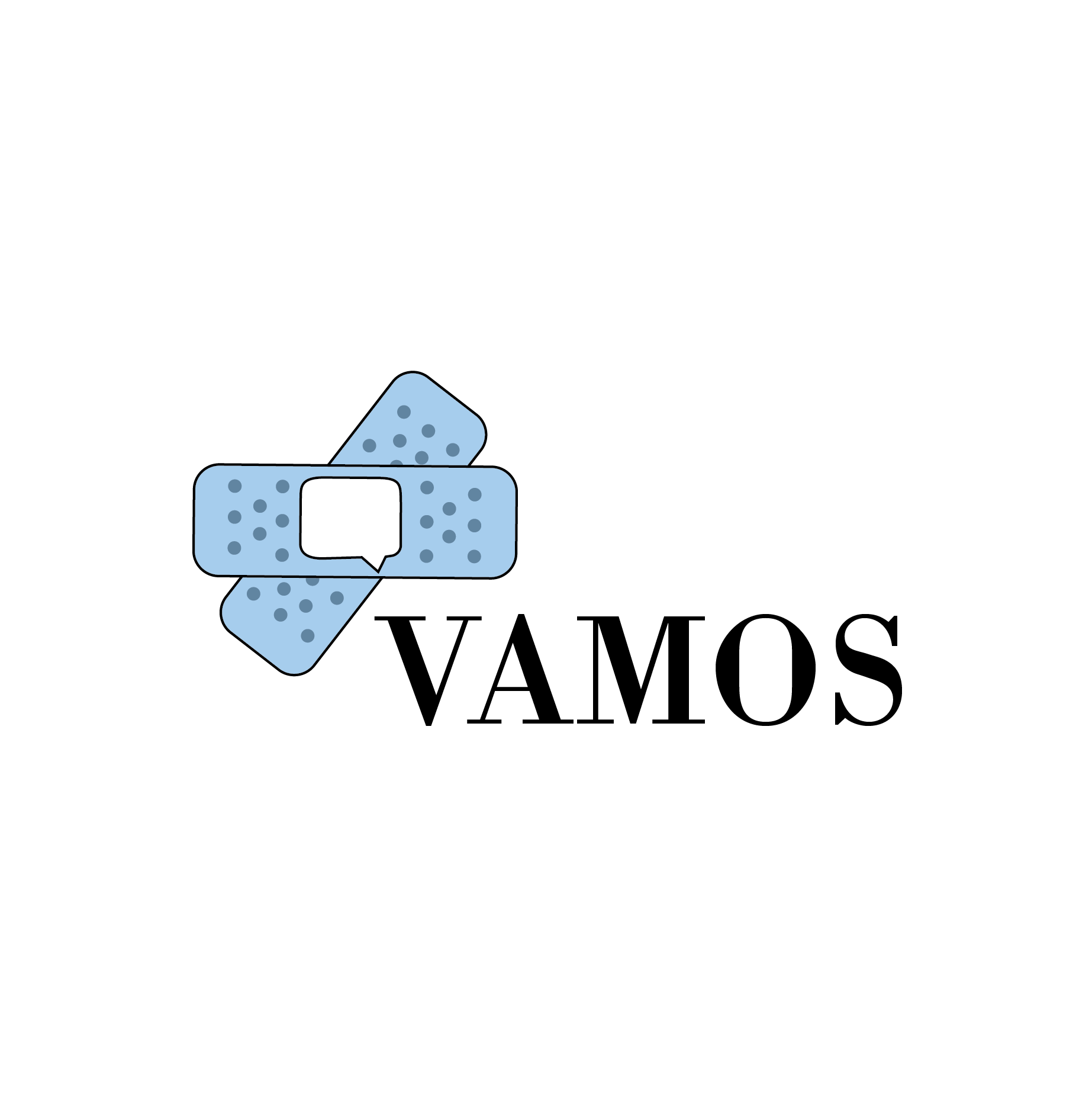
The VAMOS logo merges two symbolic elements: Bandages representing healthcare, healing, and physical care, and a Speech Bubble representing communication and language access
Together, they reflect the mission of VAMOS: conversation meets care.
This visual identity establishes warmth, approachability, and clarity. Elements that are often missing in traditional medical branding.
Together, they reflect the mission of VAMOS: conversation meets care.
This visual identity establishes warmth, approachability, and clarity. Elements that are often missing in traditional medical branding.
While working on this project, its main base of operations was Charlotte. I spent a lot of time researching and speaking to people in the Charlotte area, from patients who were unable to speak English to actual medical translators who were able to give me a way to see into how impactful and necessary their presence truly is.
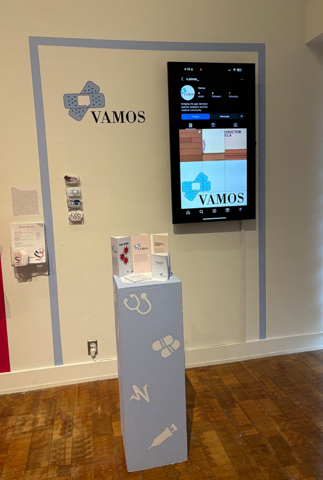
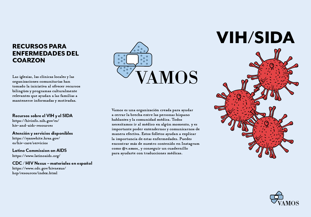
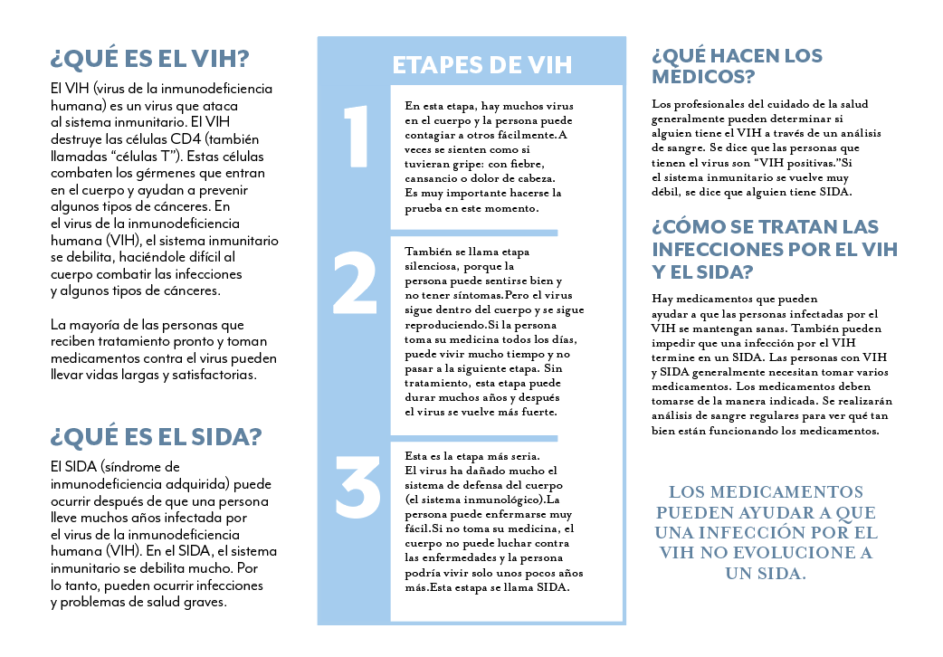
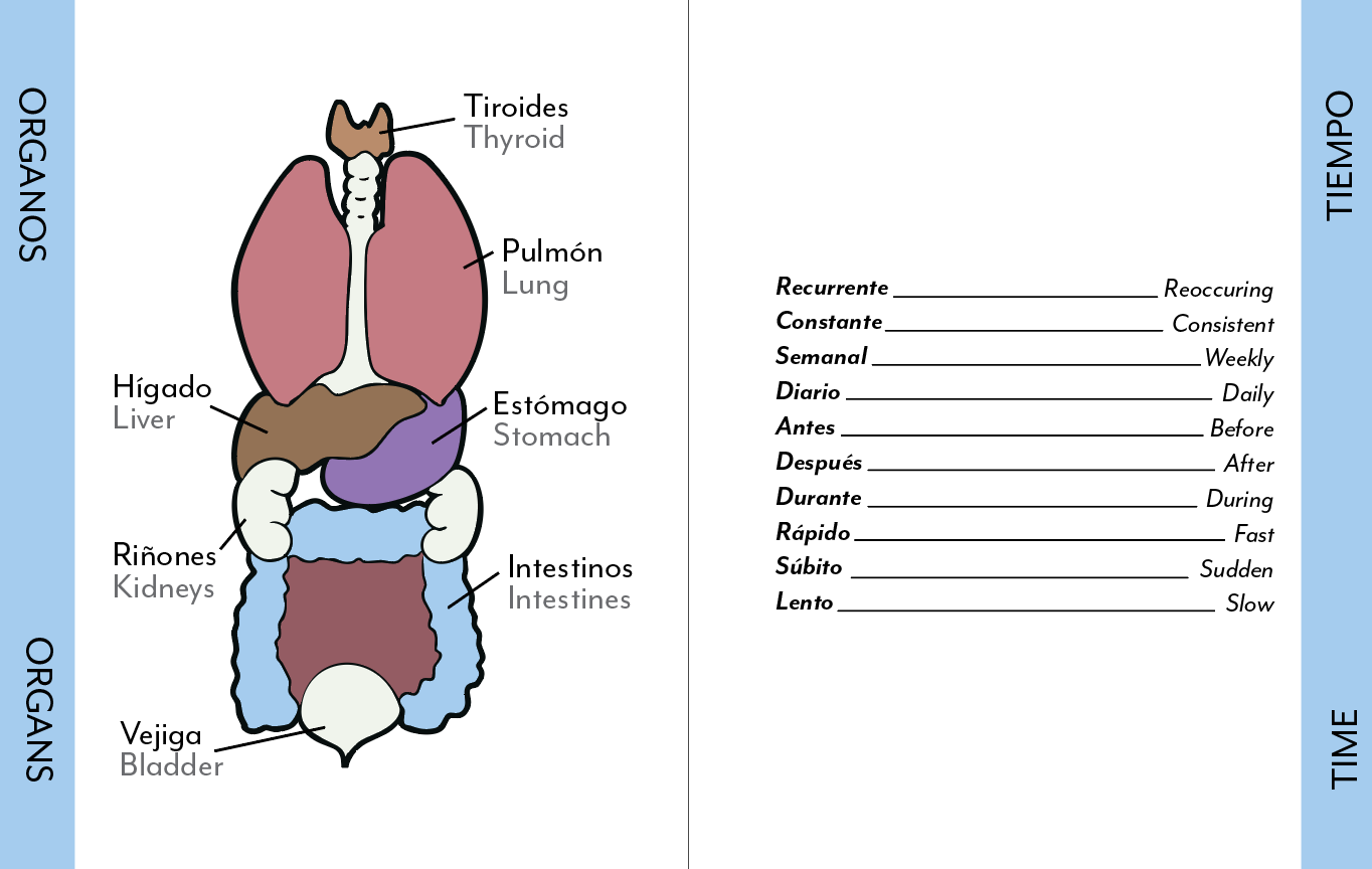
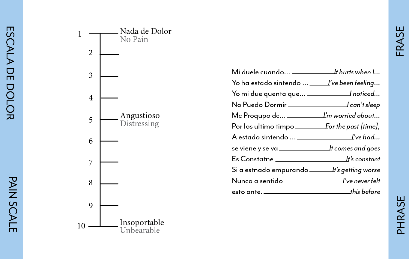
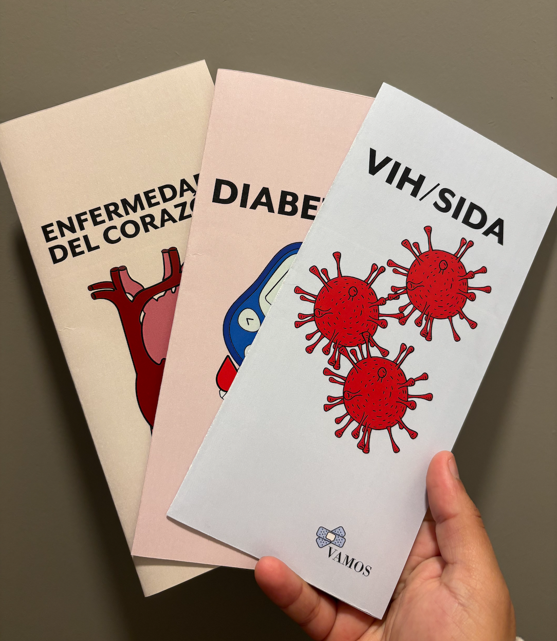
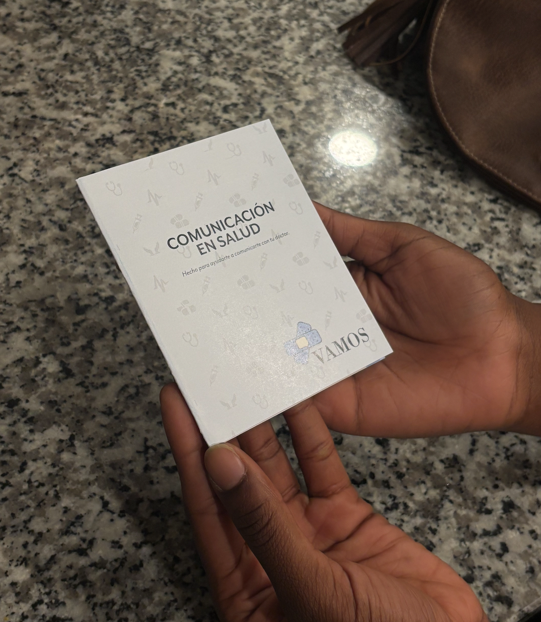
Many Spanish-speaking patients struggle to communicate their needs in medical settings, which can lead to fear, confusion, and hesitation to seek care. VAMOS was created to address these gaps through a series of accessible print-based tools: a booklet that assists patients during check-in and translates medical terminology for both patients and doctors, a set of pamphlets covering common diseases within Hispanic communities, and an advertising campaign encouraging individuals to feel confident visiting healthcare providers. By providing information in Spanish and tools that support real medical conversations, VAMOS aims to make healthcare feel more understandable, approachable, and less intimidating for non-English speakers.
Every design choice in this project was intentional. Soft colors were selected to evoke comfort and calmness, while clean typography ensured readability across different age groups. The language stayed direct and approachable, avoiding medical intimidation and keeping information accessible. Visual hierarchy was used to make details easy to scan, and icons were incorporated to enhance understanding without overwhelming the viewer. Together, these decisions created a system rooted in clarity rather than complexity, balancing empathy, education, and design as the core pillars of healthcare communication.
VAMOS allowed me to explore how design can have an impact beyond visuals through language, comfort, and community understanding. In future development, I would expand the booklet into a mobile app or digital interface, allowing even broader access to medical translation and appointment tools.
Through VAMOS, I had the opportunity to design and produce a full installation independently for the first time, expanding my skills in print and animation while applying layout design within a physical space. Working with vinyl to install both a pattern on the stand and a logo on the wall also gave me valuable insight into material selection and how design translates during physical installation.