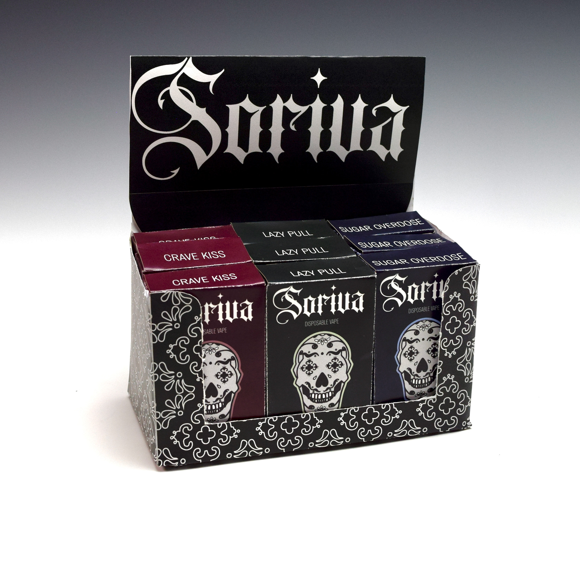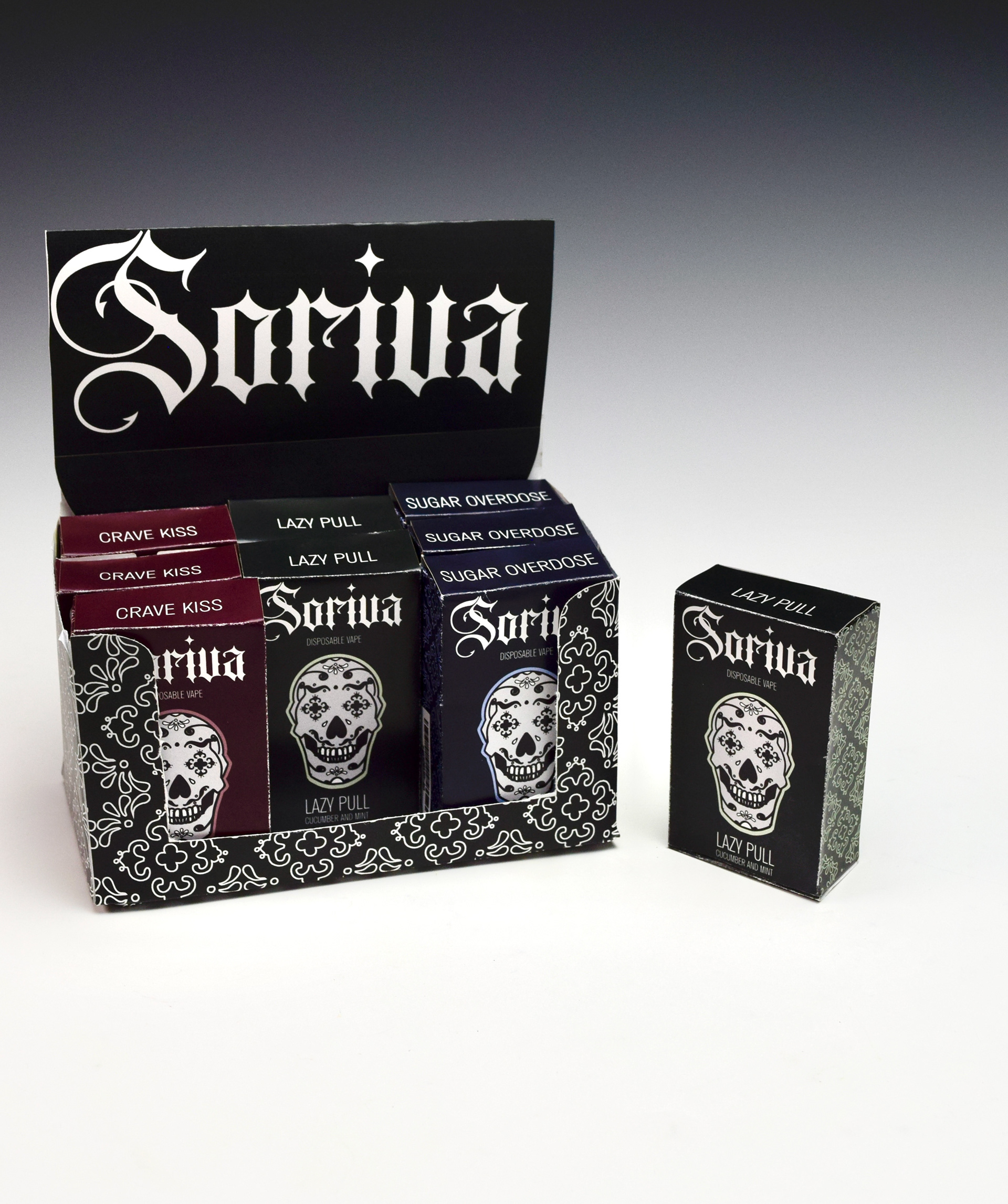
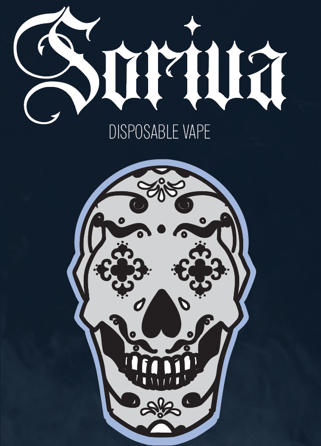
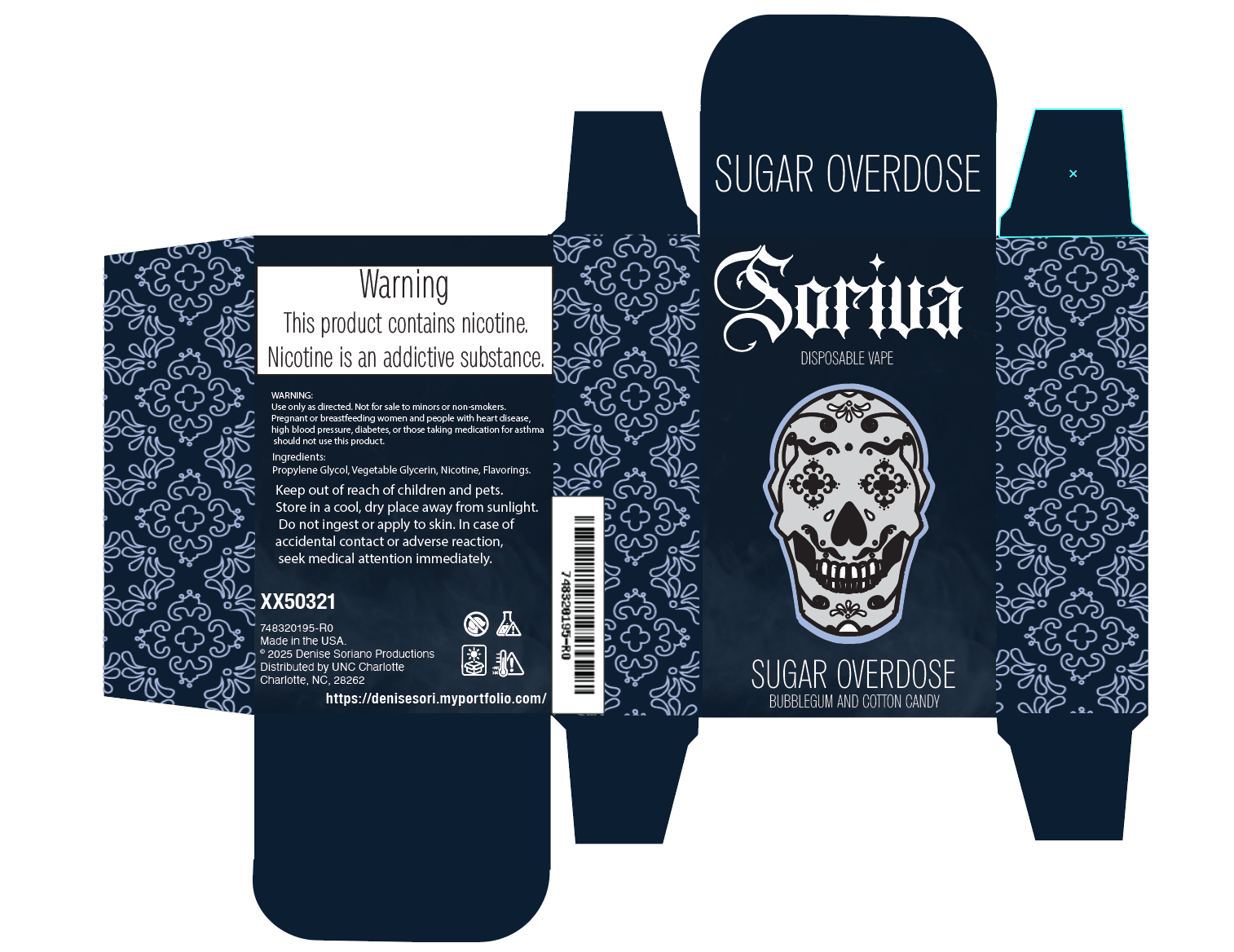
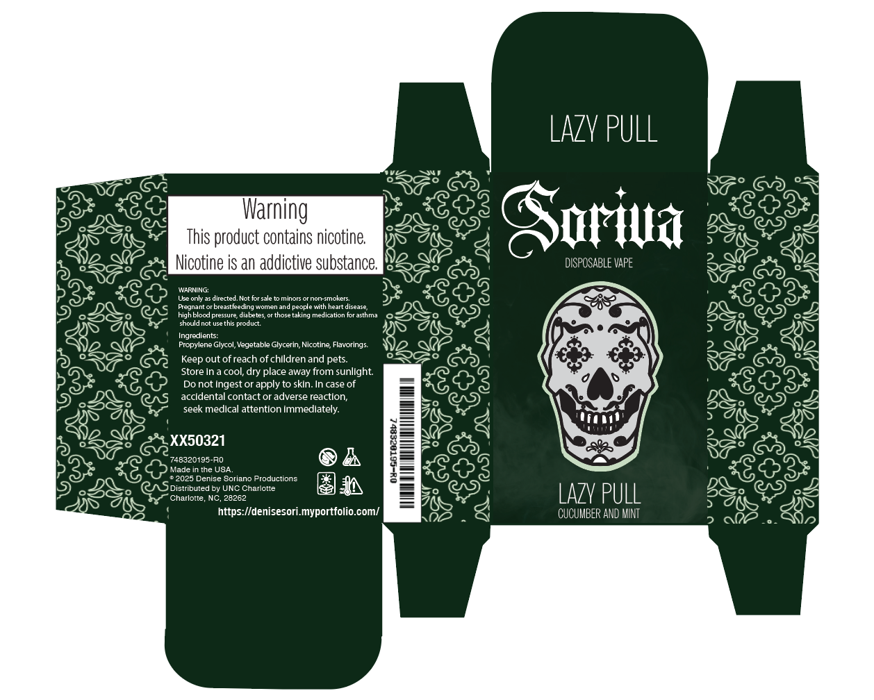
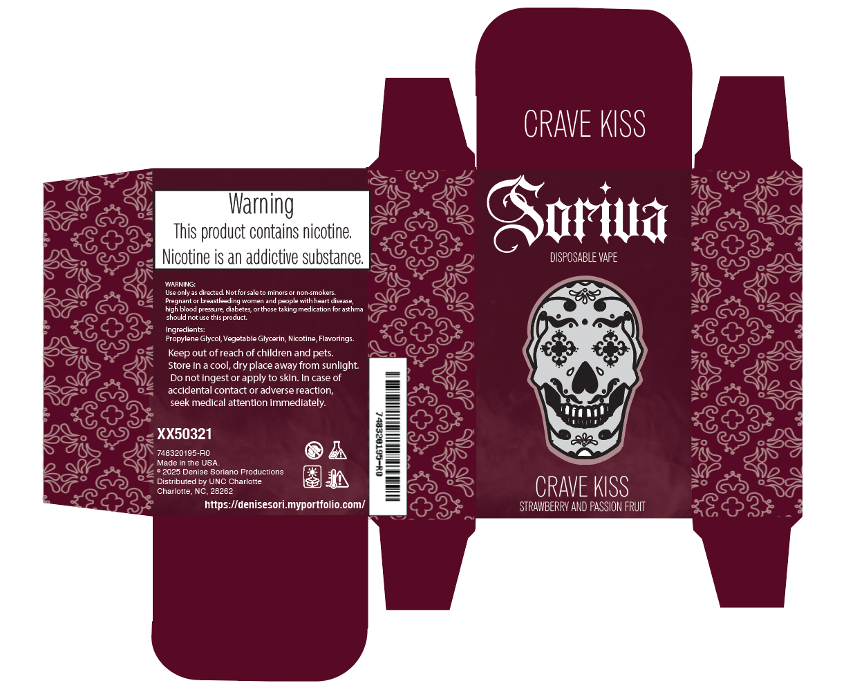
Soriva is a vape brand I built from concept to completion. My work included designing the primary product packaging and pop-up boxes, as well as establishing the entire brand identity, logo, color direction, typography, and overall visual tone. This project reflects my ability to build cohesive branding systems starting from a blank foundation.
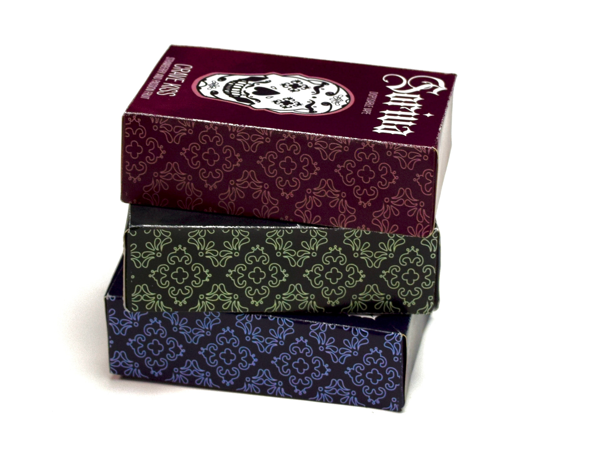
The brand identity was built around a style rooted in cultural influence and visual storytelling. I incorporated elements from my Hispanic heritage, using a traditional lace pattern and a sugar skull as the main logo to convey cultural richness. This design direction set the tone for the product packaging, especially in the vape box line, establishing a strong, recognizable brand presence.
Designing the lace pattern posed a challenge. While traditional lace features very small patterns to maintain its see-through quality on fabric, I needed to adjust the design for the actual cartons. My goal was to ensure the pattern remained visible while creating a translucent effect similar to that of original lace. This led to the decision to make each carton’s lace a slightly lighter color than the background, achieving a blending effect that mimics translucence.
Designing the lace pattern posed a challenge. While traditional lace features very small patterns to maintain its see-through quality on fabric, I needed to adjust the design for the actual cartons. My goal was to ensure the pattern remained visible while creating a translucent effect similar to that of original lace. This led to the decision to make each carton’s lace a slightly lighter color than the background, achieving a blending effect that mimics translucence.
Pop up box
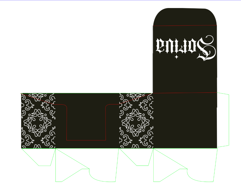
I designed a packaging system that could be applied across multiple flavors, allowing them to be sold together as a cohesive product line. Along with that, I designed a pop-up box that could be used not just to ship the product but also to serve as a stand for retailers to put up and display to sell easily.
Creating a die line for a pop-up stand/ mailing box was quite a challenge, especially since it was my first experience with die lines. It involved a lot of trial and error, multiple mockups, and numerous adjustments to the measurements before I could finalize the design. I aimed for the box to reflect the style of the cartoons, but since I was working with different flavors, I couldn’t use the same color as any of the other boxes. I ultimately decided to go with black as a neutral color. To maintain a cohesive look, I incorporated a lace pattern that was consistent across all the cartoons. I kept the design simple by placing just the brand name on top, ensuring it would be easily accessible and highly visible in a retail environment.