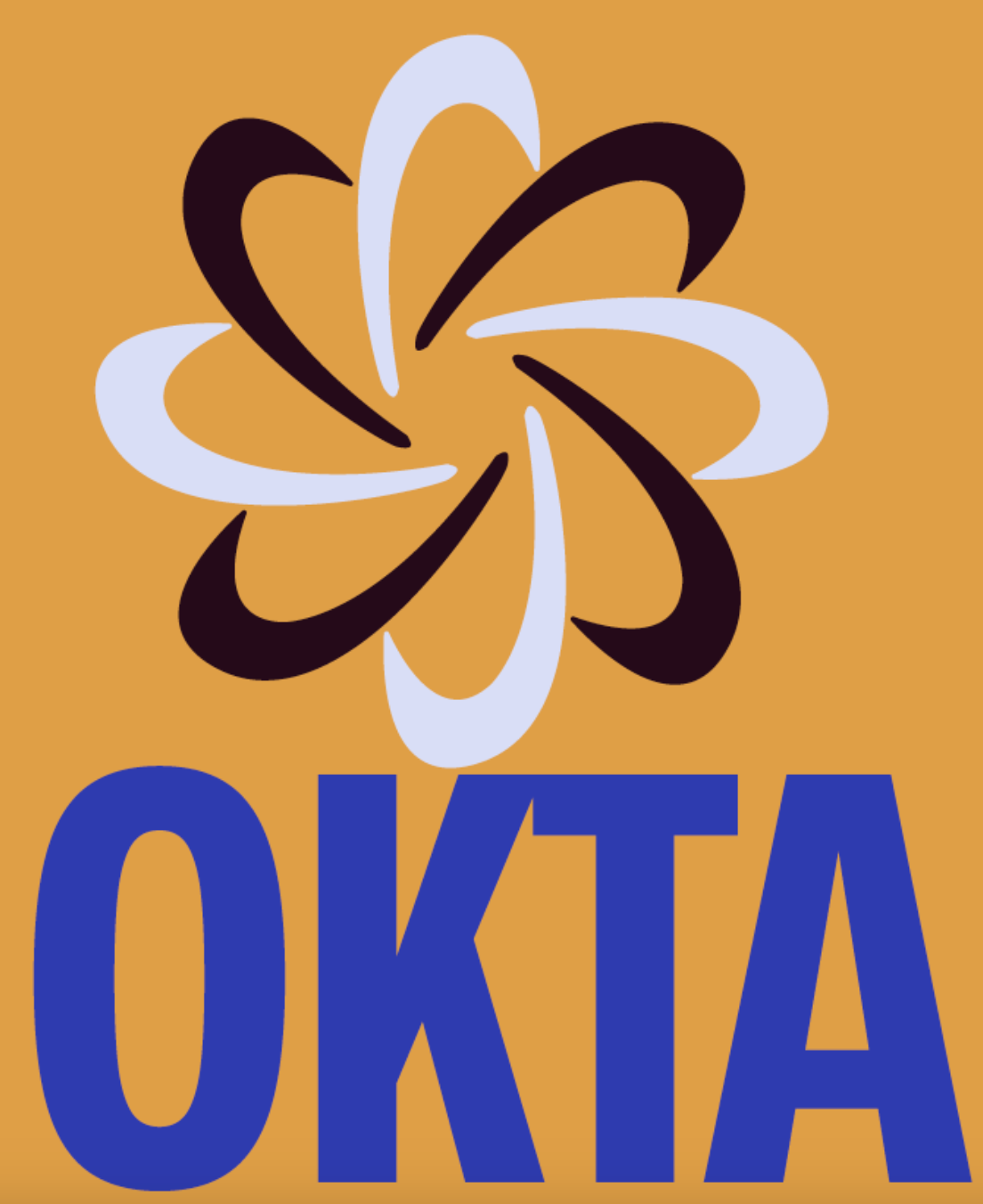
Okta is an IT management company with a focus on user-based logins. When it came to redesigning the logo for Okta, I wanted the idea of bringing two things together: the consumer and the company itself, which led to the two different colored revolving icons above the text. I used the color blue since it's known as a color for intelligence, and then added an accent of yellow, which would help it stand out against the primary blue.
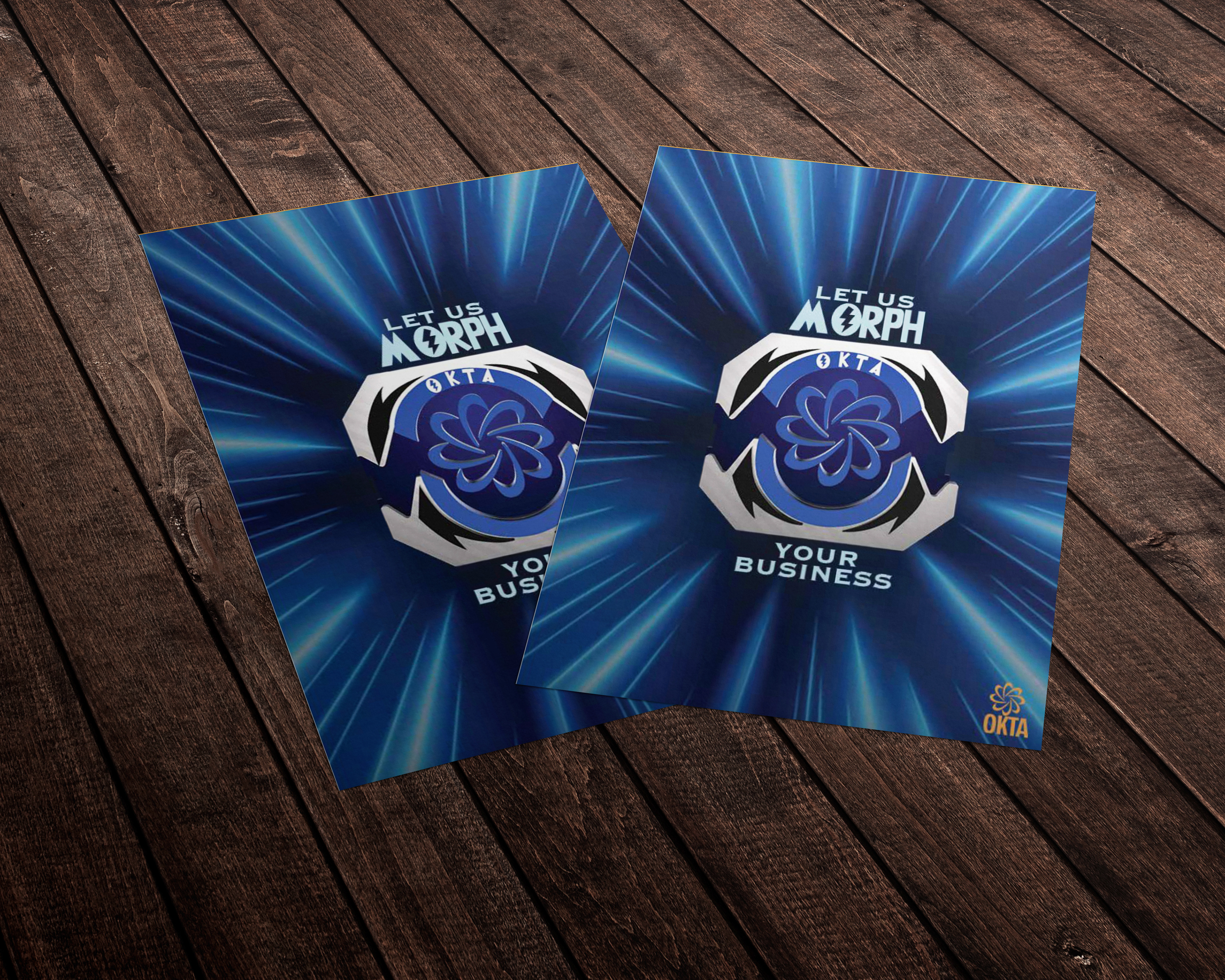
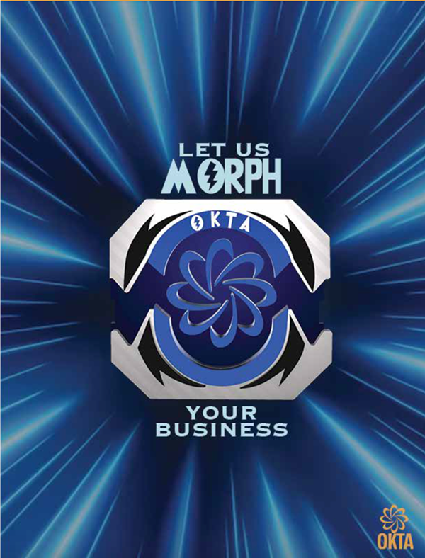
Along with the task of redesigning the logo, I was tasked with creating an advertisement meant to reach a new audience. I choose to use Power Rangers to give them that fun aspect that never gets tied to IT. Using the morpher to represent how only one person should be using an account, the same way only one person could use their morpher. I replaced the inside design with the OKTA logo. Along with that, I also designed the mailer box that would go hand in hand with this advertisement.
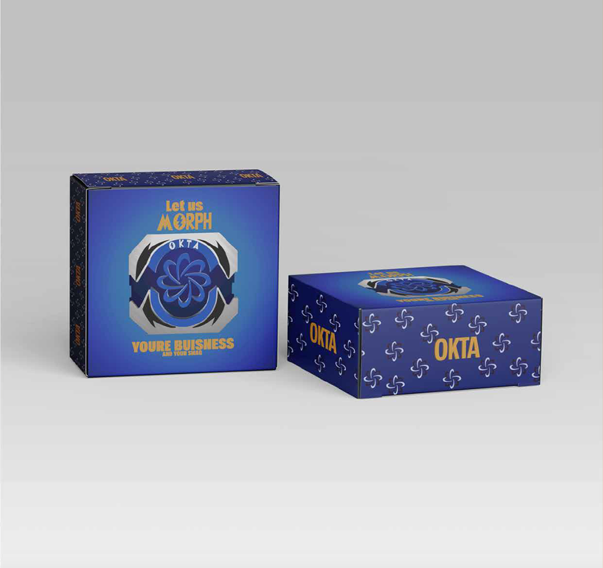
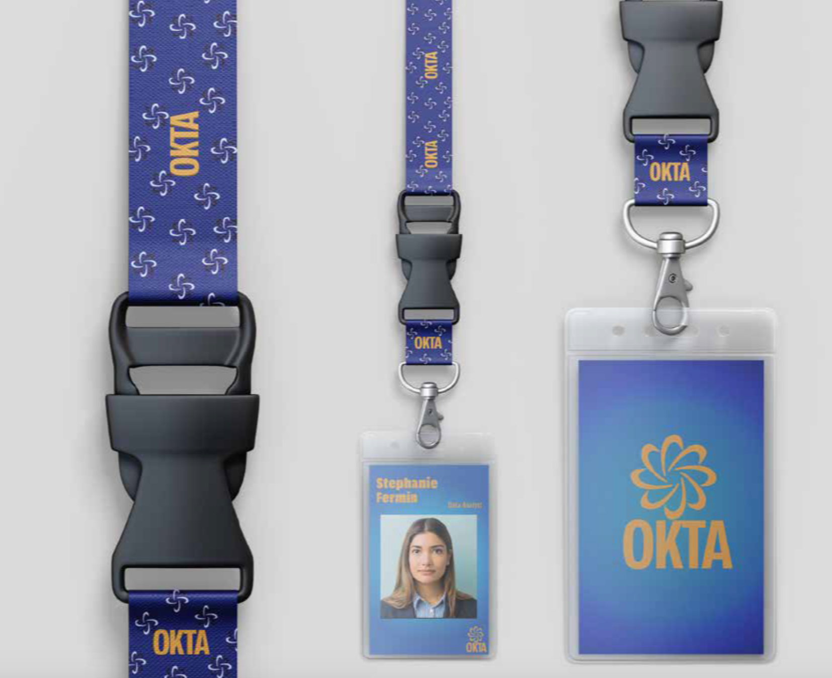
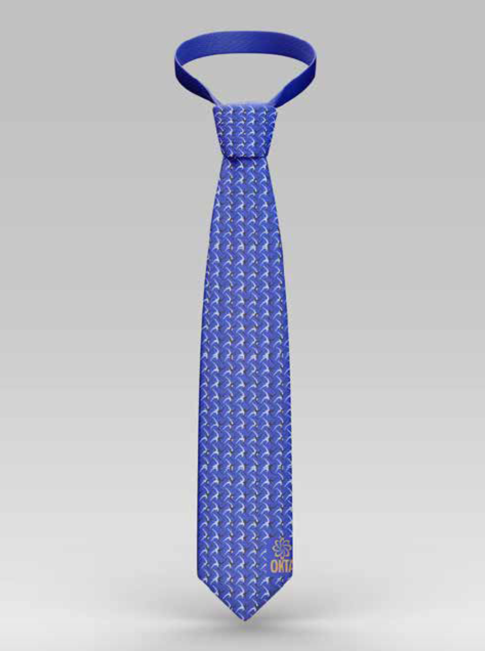
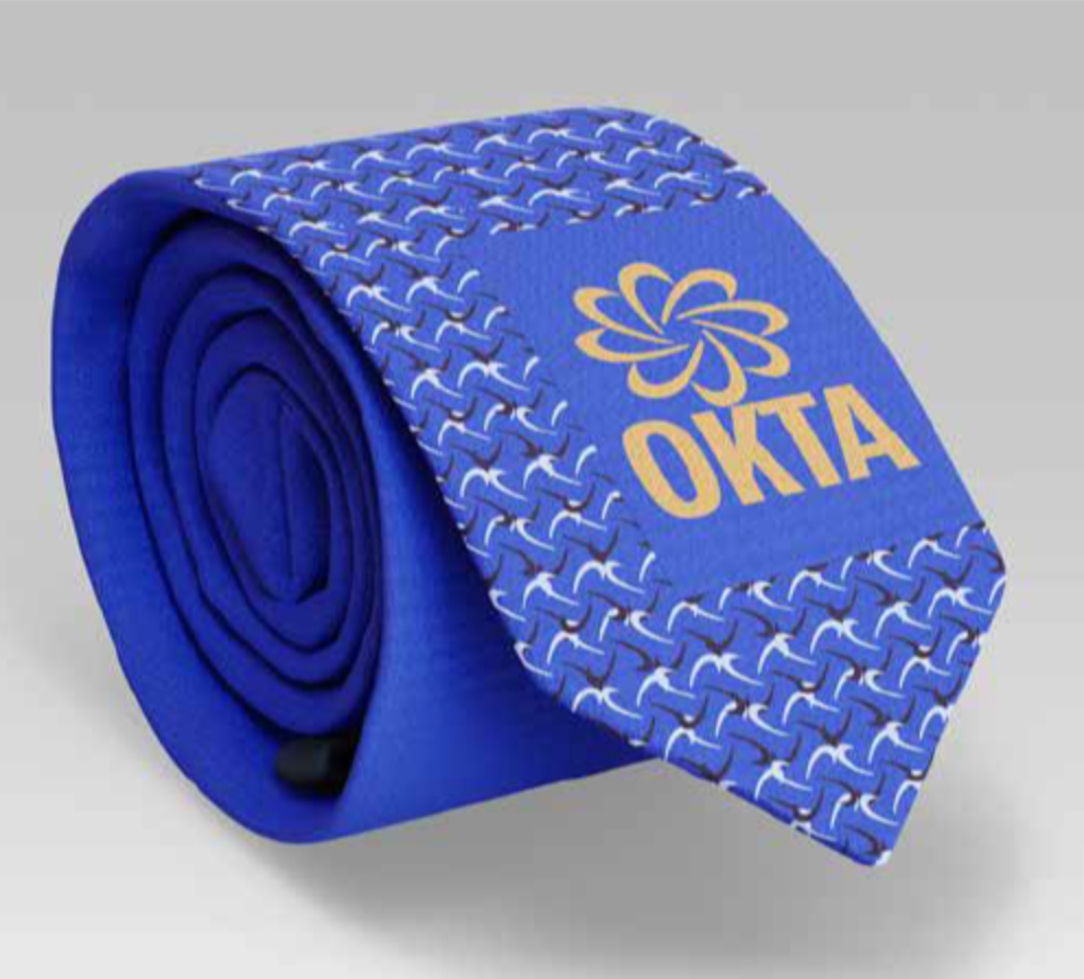
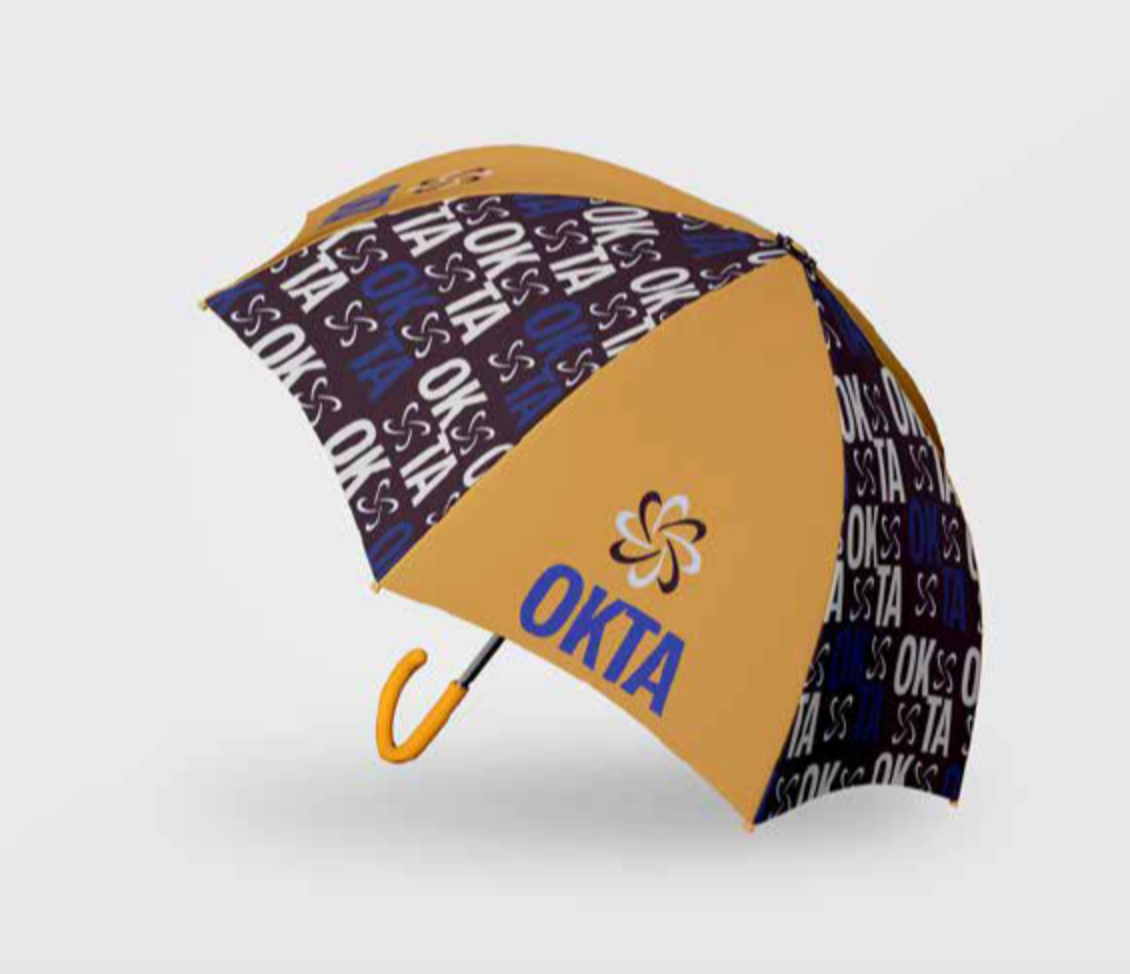
I was also tasked with creating items meant to go in the mailer box using patterns I designed to represent OKTA. I chose things that could typically be found in a corporate setting, such as ties and lanyards. For my last item, I chose something more practical that everyone uses and could be used to advertise OKTA outside of a corporate setting.