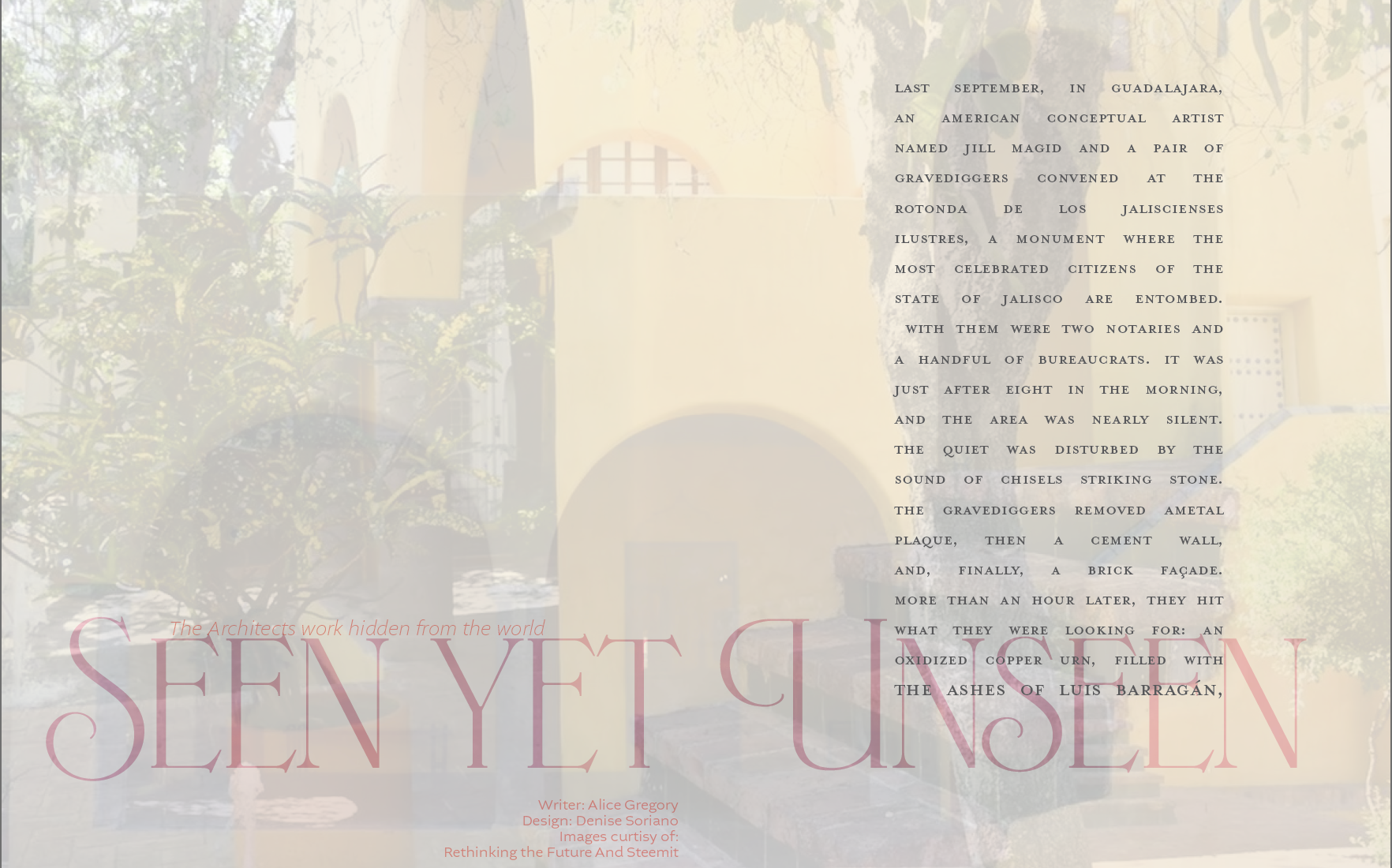
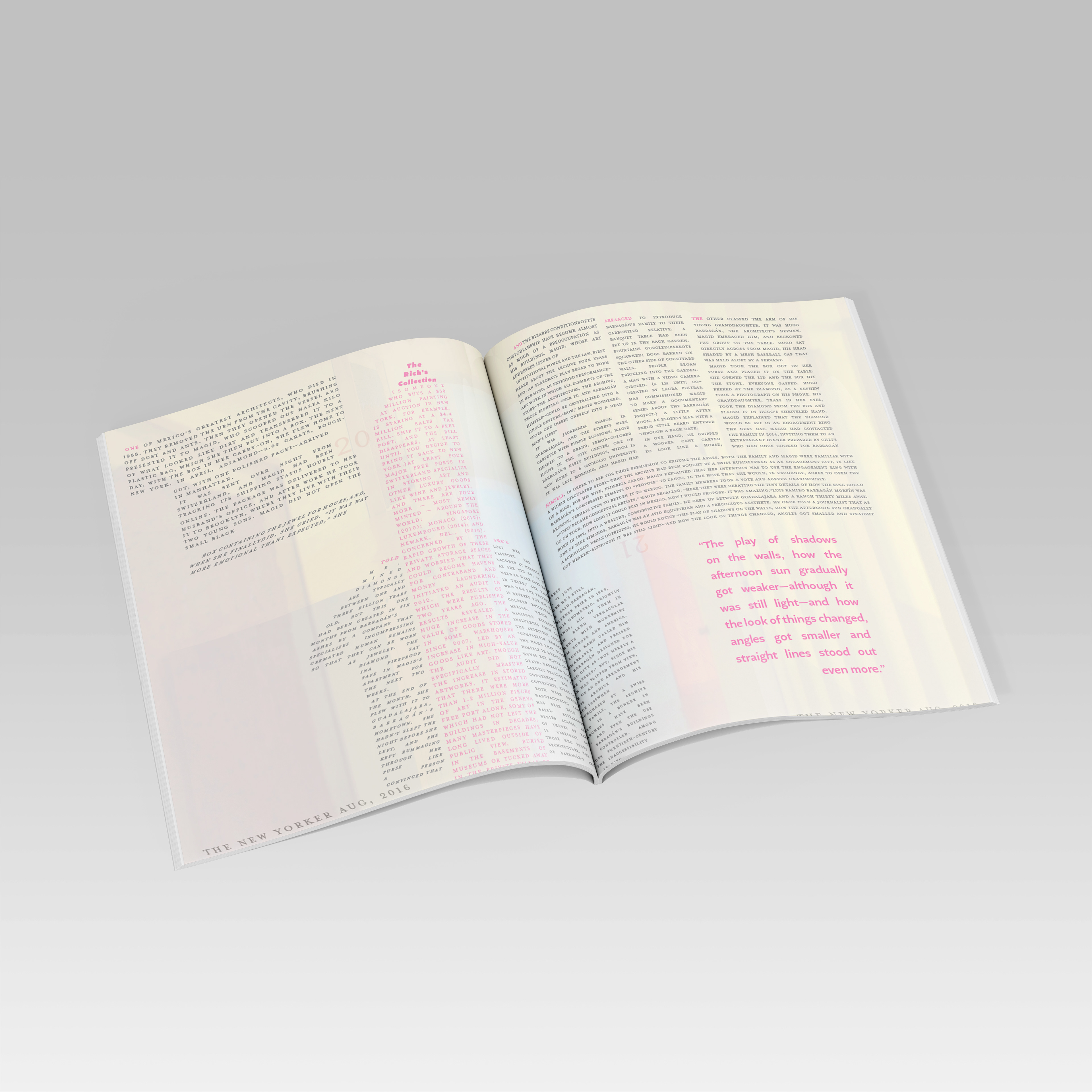
When it came to designing this piece, I wanted to bring out the main point of the article, which was that while his work is still standing and we could be able to see it from a distance however someone bought it and upon taking ownership no one has been allowed to walk the halls and truly get a chance to admire his work or even able to read the architecture plans. Overlapping images as the background allows the portrayal of being able to see his work, but not being able to get a deeper view.
When it came to the text, it was also used to push this message further. Each excerpt is shaped using references from his actual architectural buildings, allowing the reader to see his work in the writing while still keeping the background photographs. The use of pink was not just for it to stand out from the background, but because Luis Barragan often expressed that his favorite color was pink. You can also see a lot of pink in his works.
These were videos created in connection with the article, describing his work. The objective of these videos was to create a text animation that would go hand in hand with the article, following the aesthetics and previously established themes. The challenge here was making sure that the text followed the voice of the video without falling behind or feeling rushed, matching the tone of the speaker.